DesignISTA

DesignISTA is devoted to high fashion couture interiors, particularily unique, and lavish interiors.

Sunday, April 5, 2009

Requirement for my dream home #1: Light airy spaces. Preferably with elements to keep those spaces feeling even more open, like these fantastic screens...

As you can tell just by looking at my banner, I love simple repeated designs like the screens used in this home by Philip Galanes. Much more visually interesting than a wall!

philip galanes
While many cultures use this concept in their own traditional styles, the funny thing is that I'm drawn to them because it's such a Southern California thing (like the entrance to the Parker in Palm Springs!). The designs remind me of the cinder block fences and entrances around the neighborhood in Venice Beach where I grew up.

philip galanes2
So, maybe it's an element of nostalgia that makes me really love this look? What do you think? Is it too retro for you, or just as cool as ever?
You might lik

Fall Palette

Im loving this by Pantone's Fall 2009 Fashion Color Report this year. Maybe it's because the color combinations are endless and exciting? Or perhaps it's because a few of these palettes match some of my absolute favorite interiors...


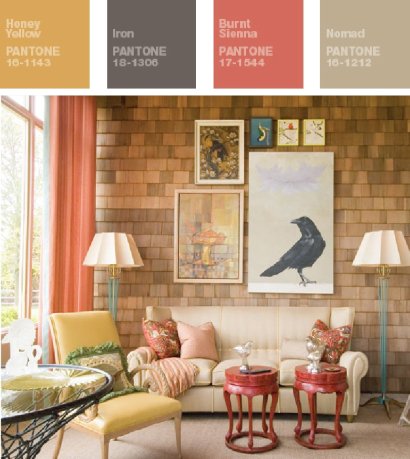
This combination of colors has to be one of my all time favorites - in fact, it's exactly what I've been going back to in my bedroom! Earthy, warm shades with a touch of grey. Done to perfection above, and interpreted with a few other colors below...

pantone fall palette2
room by jay jeffers

pantone fall palette4
room via aussie vogue

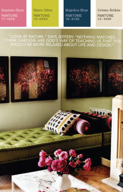
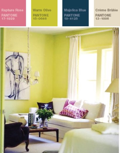
I also love this unexpected grouping of a deep teal blue with an old-fashioned rose colored pink and a dash of modern olive green (more like a chartreuse if you ask me!) And, of course, a neutral cream to balance them all.

pantone fall palette6
room via domino

pantone fall pallette8
room via domino

And, we cannot forget the red and purple hues that will continue to be strong this year. My favorite is actually to pair them together, like this room above. Such royal richness!!
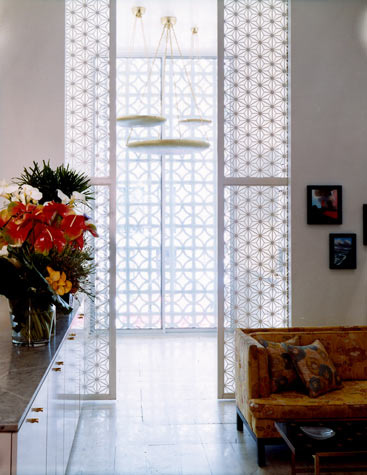
Vogue living..

This room is for the love of all things light and airy...

light & fresh aussie vogue living

There is a ridiculous amount of lucite in this retro-inspired space from Vogue Living, and I secretly think I love it (even the piano legs are lucite! insane!). The way this material works to allow us to 'see through' a room always amazes me - such a good tactic for small spaces, but in a large space like this you can still see the impact. And what are your thoughts on the change between the tiles? It achieves a similar impact as a rug would but keeps the space cool. Interesting? Or weird?

Glossy

I've long loved these 'interiors' from Gloss Creative, but I don't think I've ever shared them here on coco+kelley.

Designers of runways, sets and store windows, my favorite specialty of theirs is the marquees they've created in the past for Moet Chandon at the Melbourne Cup Spring Racing Carnival...

2007:

green draping? yes please.

2006:

(how simply fantastic is that 'chandelier'? this is my favorite!)

2005:

the circle motif was carried throughout - like champagne bubbles!

Sunday, March 22, 2009

Mary McDonald


Love the rich feeling of deep colors

{LINK}

Wednesday, March 11, 2009

Friday, March 6, 2009


Brocade Home - Patent Leather Stool - $169

Looking for that perfect accent stool, ottoman or bench for your living room...normally they are upholstered in fabric, leather or suede...not this one...try white patent leather. Feels kind of kitcsh and 70's - new millennium mod!